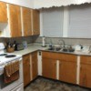
I have yellow kitchen walls on top of walls, chair railing, then beige walls on bottom of walls. The decor in kitchen is bird houses and sunflowers. The counter tops are beige Corian with a beige back splash. There is a bird house border in middle of chair railing. I have light wood floors and light wood cabinets. I would like to change the color in the kitchen. I just painted the top walls yellow. What would go with yellow?
Peggy
Add your voice! Click below to answer. ThriftyFun is powered by your wisdom!
When stumped for color harmony, go to the fabric store and look at material prints that have the colors you do have and see what other colors blend well. This way you can even come up with the right shades and oftentimes you'll have more than one choice of colors that will be complimentary. you can also look up printed fabric on the 'net if you don't want to spend time in a fabric shop.
Choose a color from your wallpaper border. Any of them will do. If it were me, I'd go with one of the greens, Olive, Sage or Hunter. If your kitchen is small, go with a lighter (more pastel) color, if it's not a small space, you can go darker in hue. Another choice that would look awesome with Yellow would be Charcoal (very dark gray) or Black. As long as it;s the bottom color. But don't use a color this dark unless your kitchen is huge!
I'd also think about painting the chair-rail to match the counter tops. That is, IF Beige looks good there. If not, think about using black on the chair-rail itself, yellow on top & a green on the bottom. And if you do, paint several of your birdhouses black to match too! I could also see Painting the bottom Copper & spray painting many of your birdhouses a shiny copper too!
Remember to have your main 2 colors go all around the room, in at least 3 places. For example if you choose green, be sure it's taken all around the room. If it's dominate in the border-print you'll not have to worry about this. The border-print will do this for you!
What is the predominant color other than yellow in the wallpaper and border?probably dark brown, like the center of the sunflower.Choose one of these darker colors to play off of,since it sounds as if your kitchen is VERY light, neutral colors already,anything light will just make it look even more washed out and boring.
Add your voice! Click below to answer. ThriftyFun is powered by your wisdom!